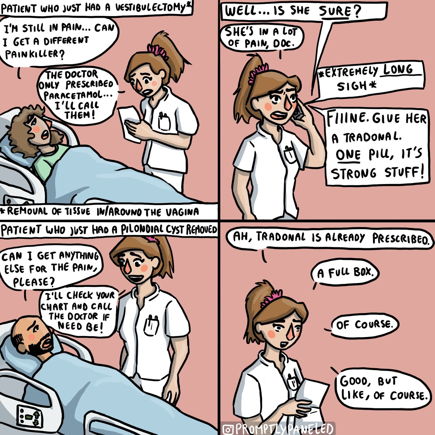
Here, clean up the comic a tad, and added Link from LoZ📺(1989) to exemplify the Misogynistic tones, to make the points clearer, as folks had trouble reading the gender discrimination thesis of the comic.
helps folks that are hard of seeing contextualize parts. Visual aids sort of speak.
Notice I colored the important parts of the Doctor’s hypocritical prescriptions.
I don’t disagree. Had to consult a praxis chat, and they were able to inform me my edit makes the comic less monochromacally, protanomaly, and tritanomaly legible.
Someone can if they want, make it more monochromacally legible, while highlighting the key words using a different font. Currently busy.


Here, clean up the comic a tad, and added Link from LoZ📺(1989) to exemplify the Misogynistic tones, to make the points clearer, as folks had trouble reading the gender discrimination thesis of the comic.

I have a strong feeling you used AI
AI edits would probably have made more sense contextually but have malformed details
wut

Ok fine, I still don’t get why you did it tho.
Much better, thanks.
I’m more perplexed at how this comic triggered misogynists. Like, tune out if you didn’t like the comic. why “unworth read” this?
Why? How was that supposed to help? It’s just exactly the same but more cluttered and confusing. Just worse.
Oh what you didn’t like the 👄 emoji inserted into the comic?
Surely that adds context
What about the shrug emoji?
helps folks that are hard of seeing contextualize parts. Visual aids sort of speak.
Notice I colored the important parts of the Doctor’s hypocritical prescriptions.
The color makes the text harder to read, imo
I don’t disagree. Had to consult a praxis chat, and they were able to inform me my edit makes the comic less monochromacally, protanomaly, and tritanomaly legible.
Someone can if they want, make it more monochromacally legible, while highlighting the key words using a different font.
Currently busy.