All these comments are great, but the real mystery is:
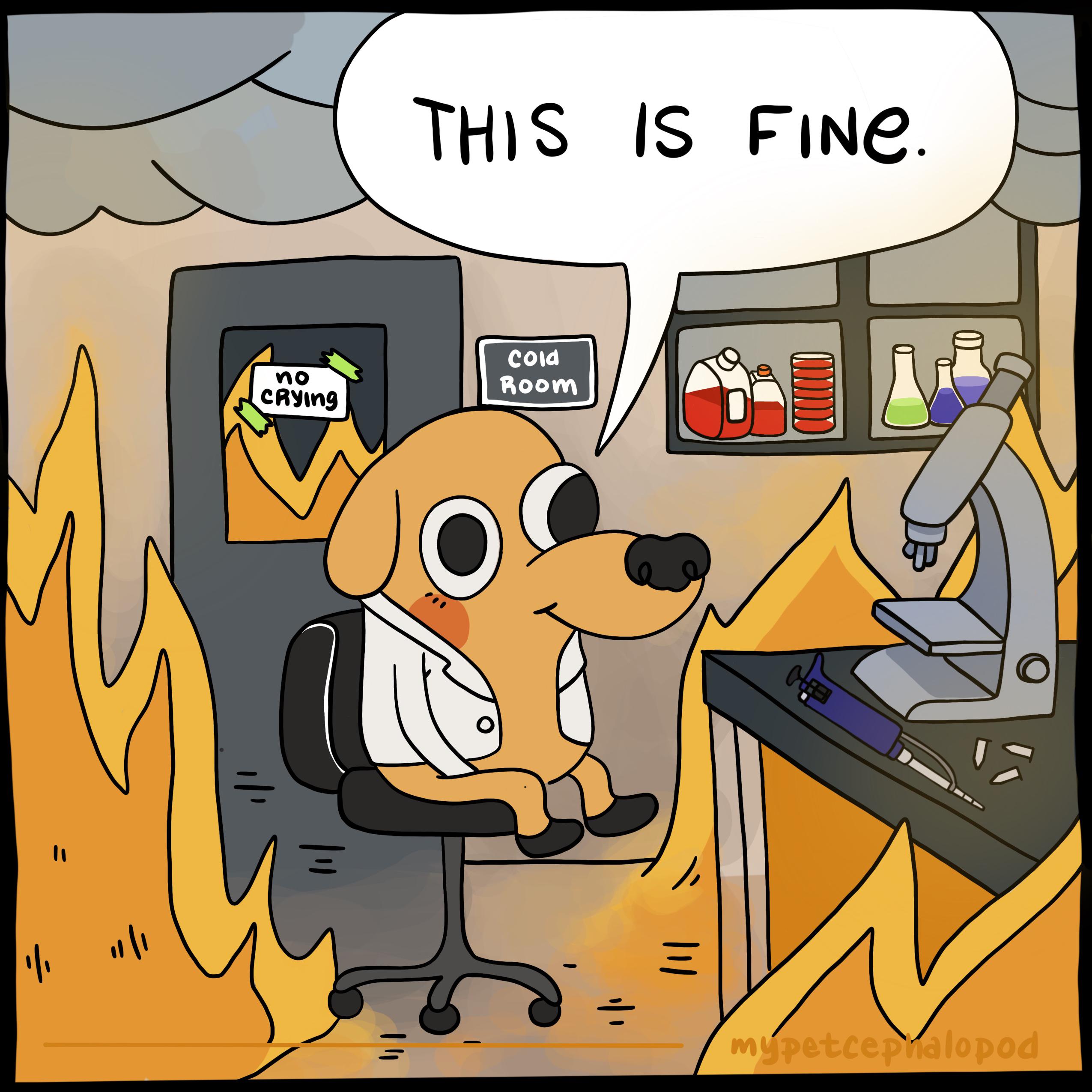
Why did someone overlay a different font on top of the original graphic rather than just make a whole new graphic? Like, the work is exactly the same, and the rest of us can view sane font placement.


All these comments are great, but the real mystery is:
Why did someone overlay a different font on top of the original graphic rather than just make a whole new graphic? Like, the work is exactly the same, and the rest of us can view sane font placement.
Original probably said ‘correlation’ when it should be causation. The correlation is established in the headline.
Apparently someone took that personally.
That was exactly what I did lmfao. It was technically incorrect, so I made it technically correct lol.